
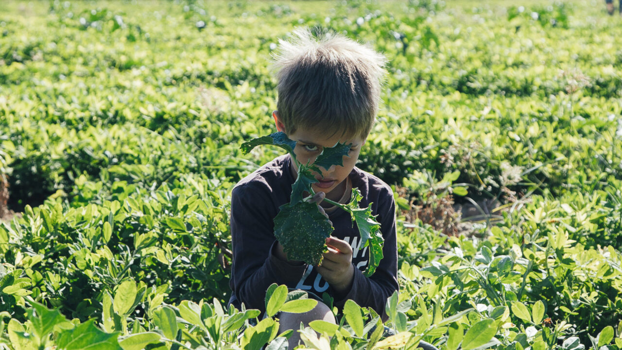
Mpardas Family
Branding – Packaging
Mpardas Family
A story that puts family first, speaks of the Greek land, and conveys care.
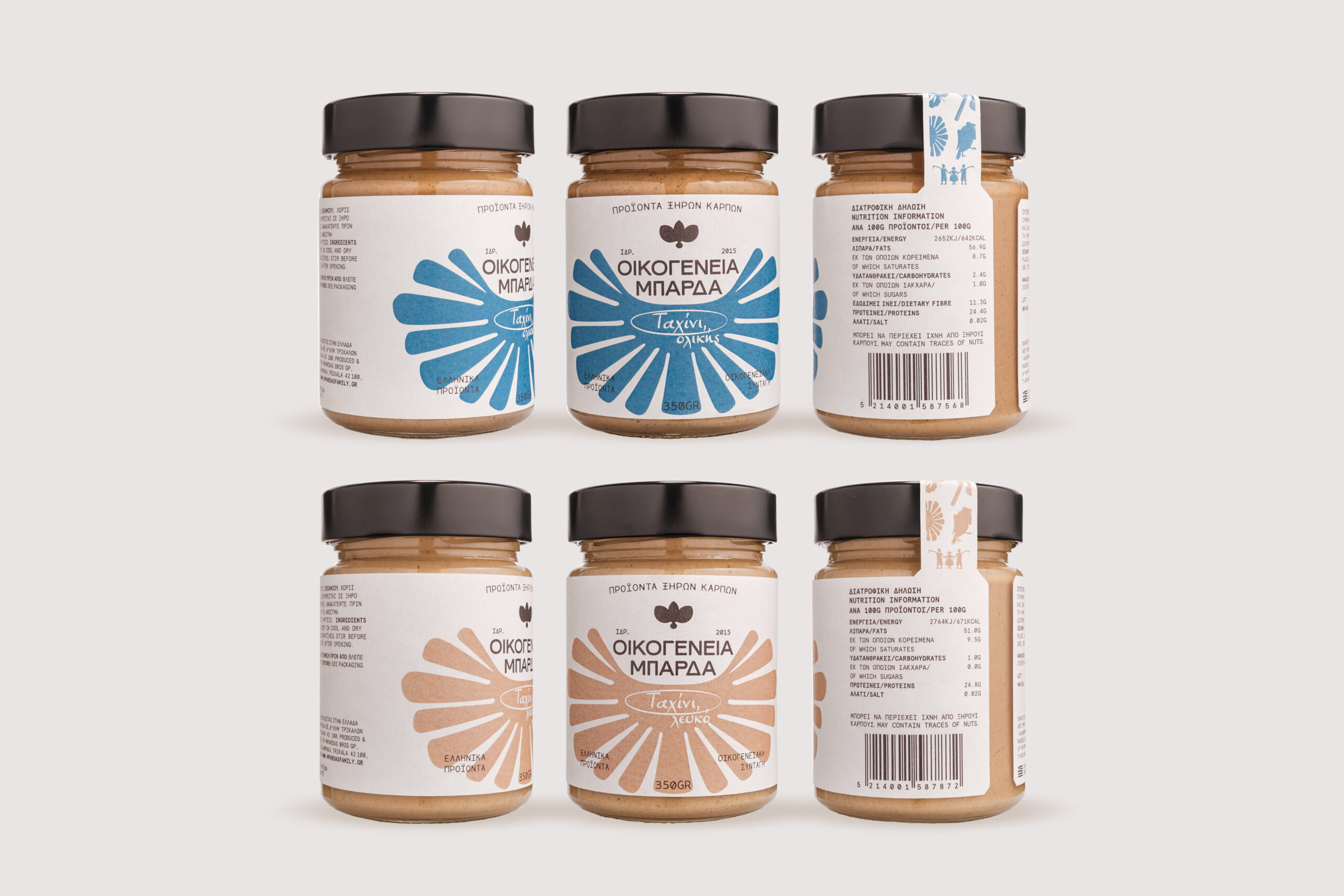
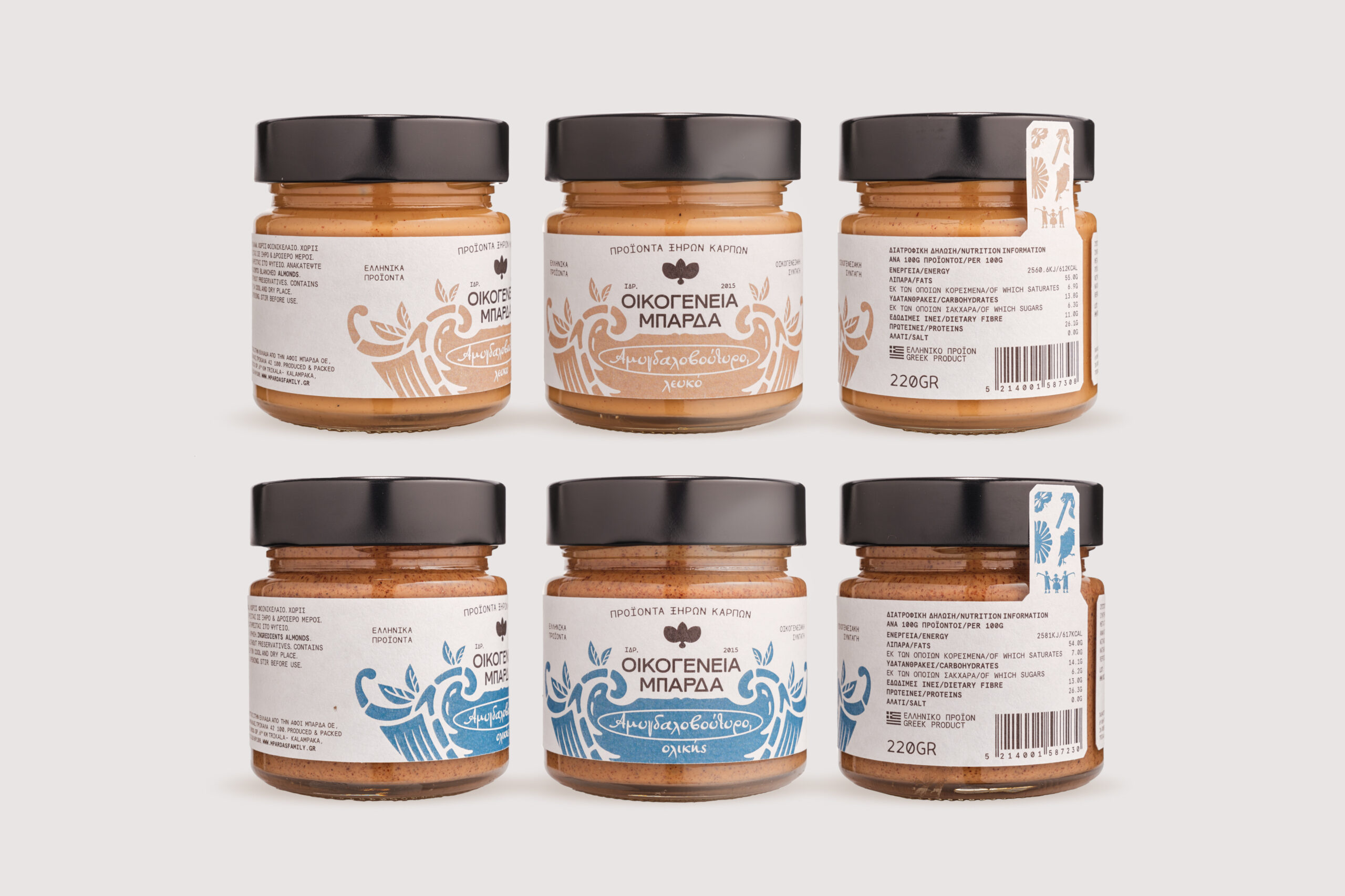
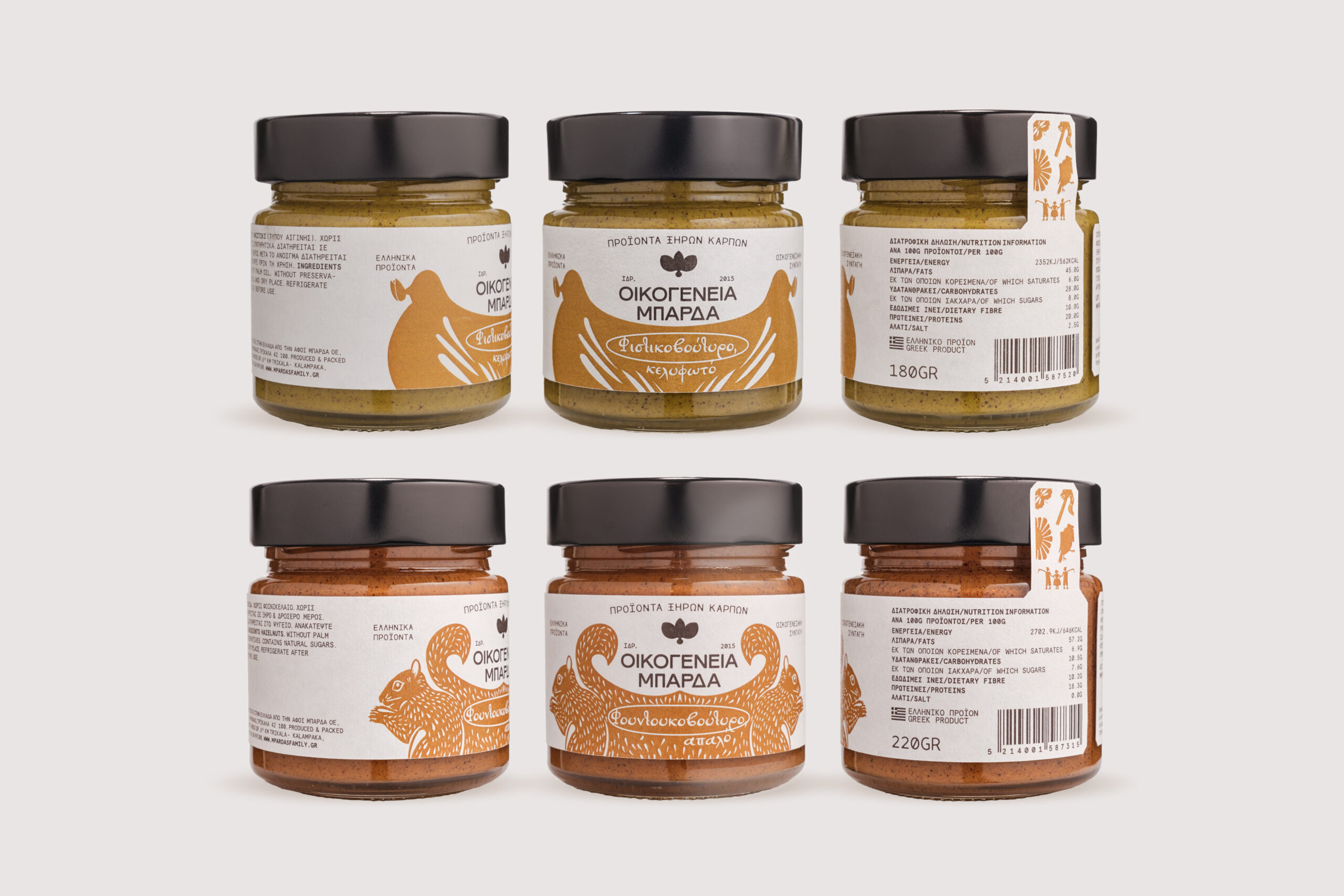
Starting from the positioning “premium, authentic, local, family-made,” we designed a new identity and packaging system for Mpardas Family Nut Products, a Greek family business producing nut butters with care, local character, and handmade quality.
The project included the strategic redefinition of the brand’s communication, design direction, tone of voice, and look and feel. The aim was to create an identity that would express the family behind the product, the Greek land it comes from, and the premium quality of its recipes — without relying on expected rustic codes.
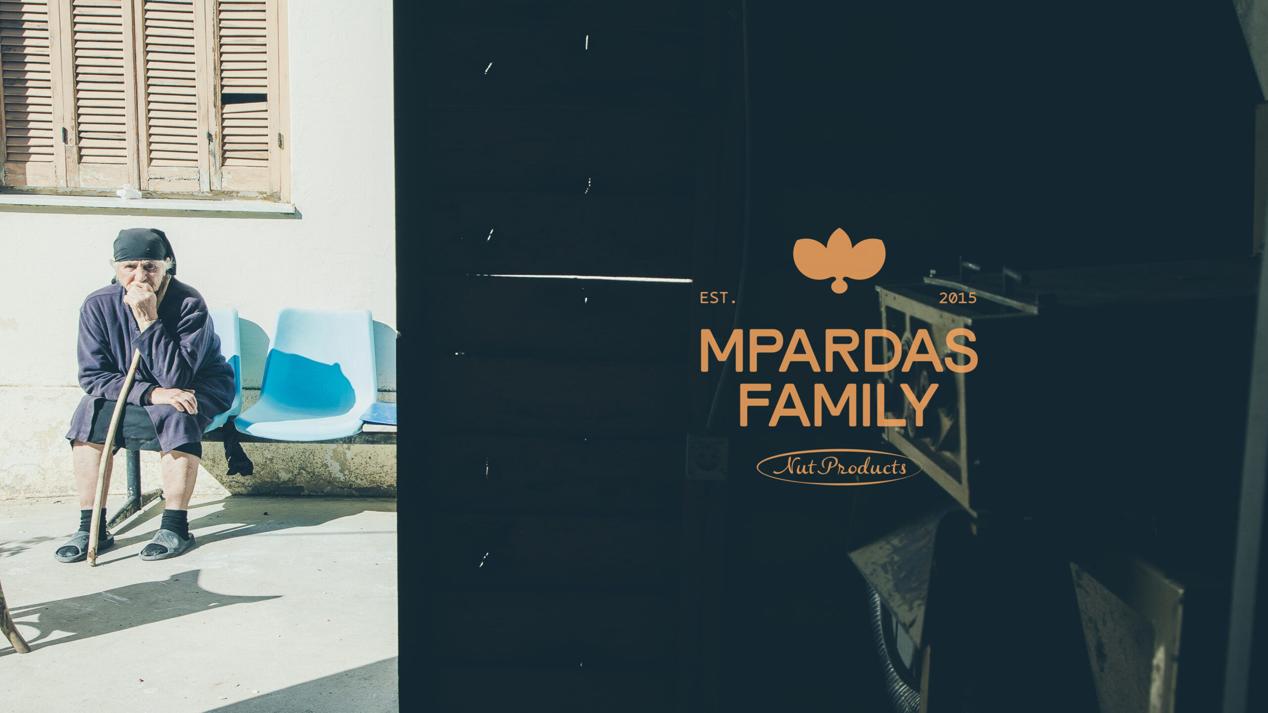
The rebranding introduced a renewed brand mark with a fuller, softer character, reflecting the rich and creamy nature of the products. Around it, we developed a flexible packaging architecture designed to organize the range clearly and consistently across different variants and processing styles.
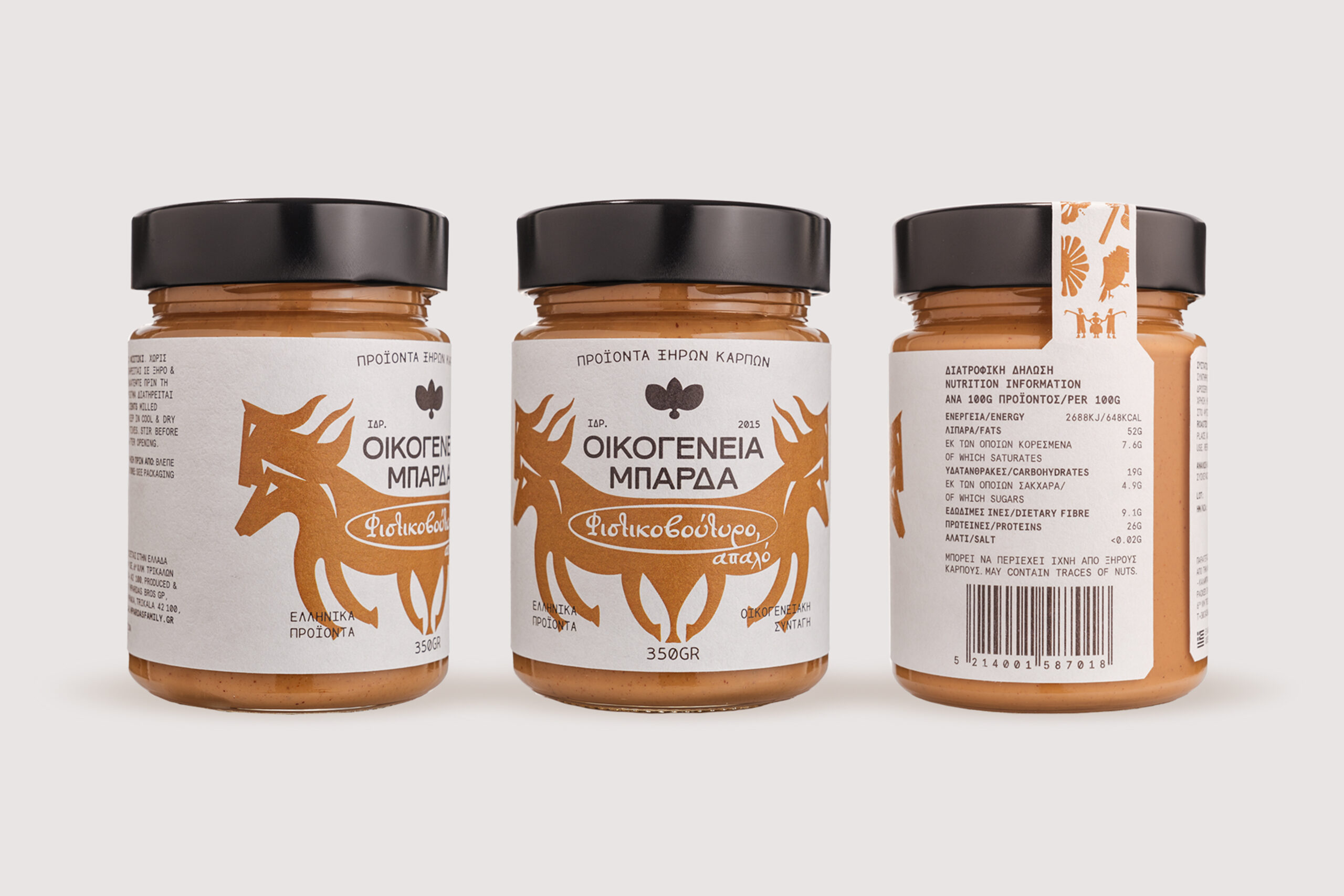
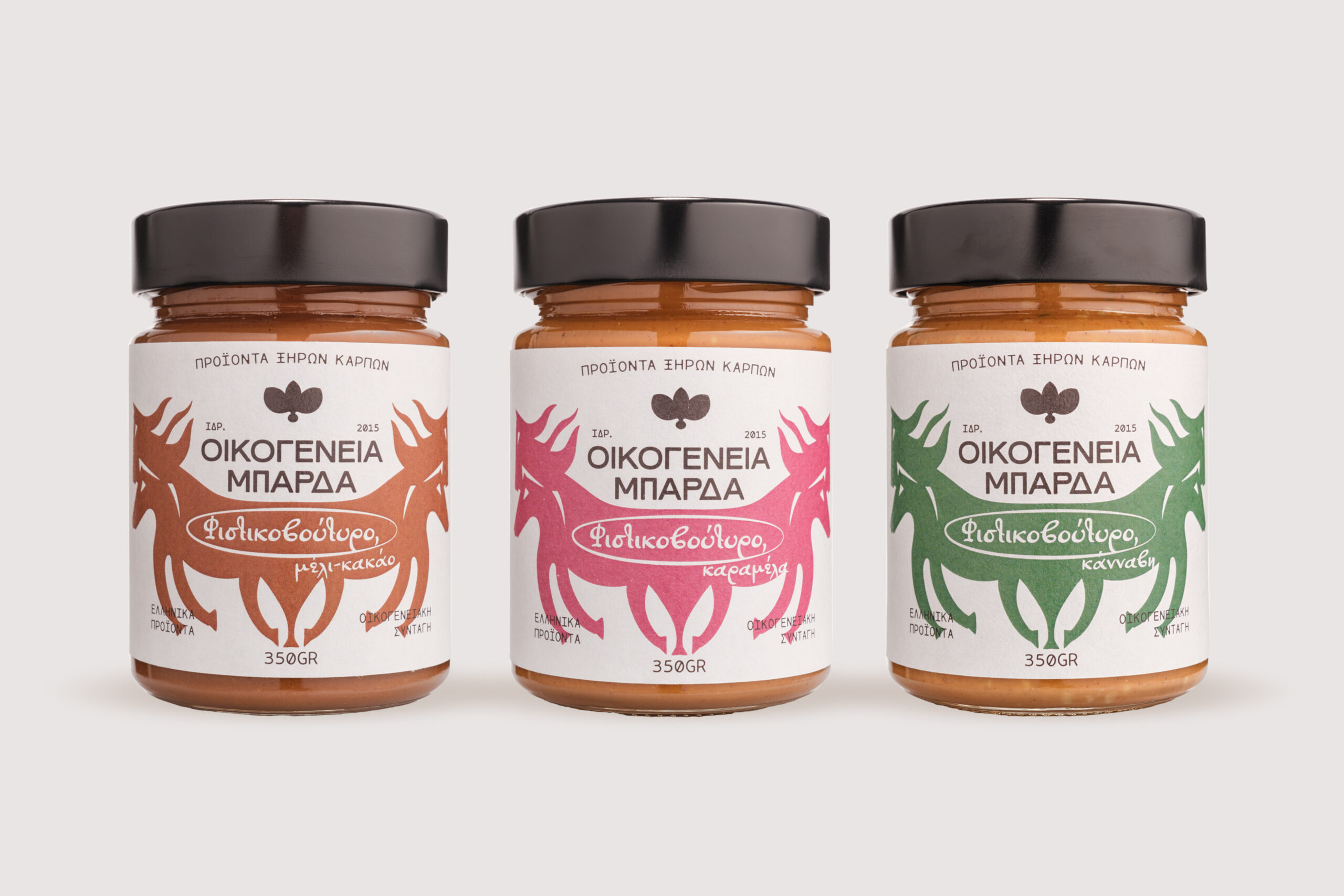
The system is based on three core elements: a set of custom folk-inspired illustrations that communicate place and product type; an earthy yet vibrant color palette that encodes each recipe; and a typographic system that combines clarity, structure, and a handwritten gesture, suggesting the intimacy of a family recipe.

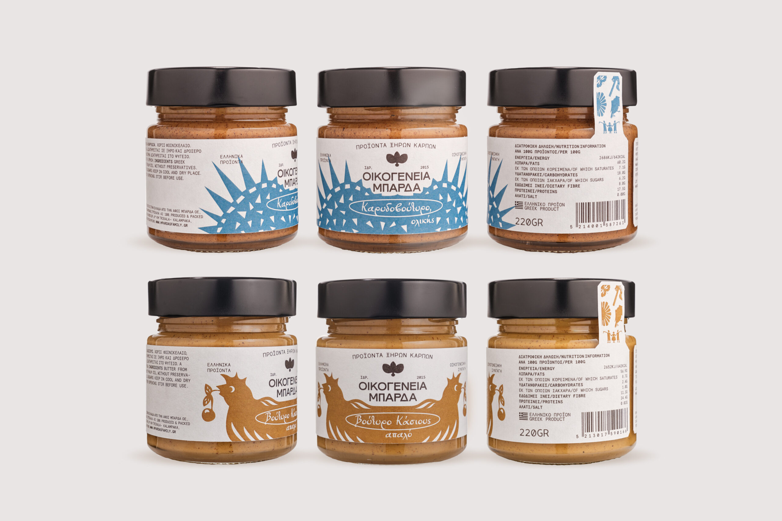
CREATIVE LEAD & DIRECTION: Virginia Barakou DESIGN / ILLUSTRATION: Virginia Barakou, Thanasis Tentolouris STRATEGIC MARKETING: Giorgos Zarogiannis PHOTOGRAPHY: Snapix!